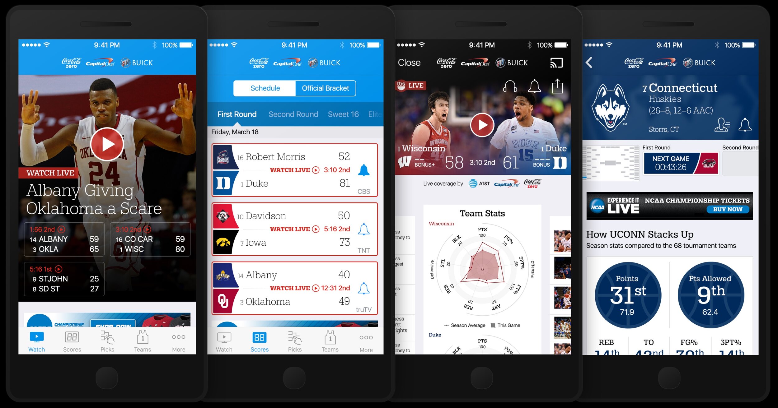
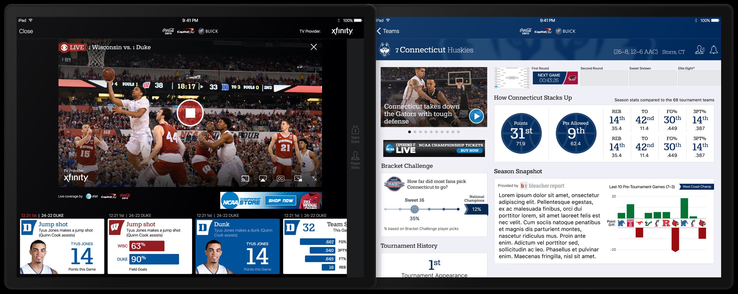
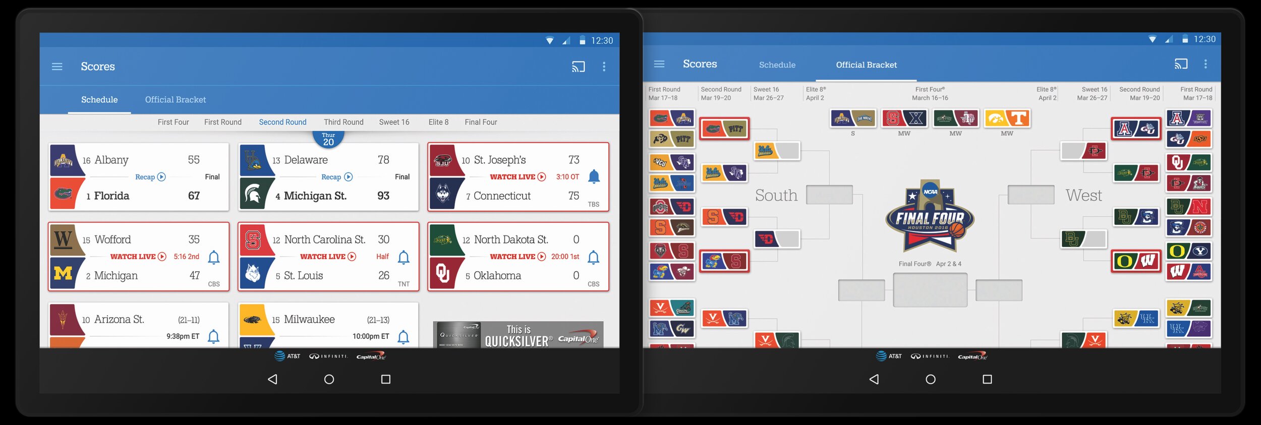
March Madness Live
Role: UX Direction • Design Direction
March Madness Live is an immense undertaking. It involves bringing fans live scores, video, and team information for every game in the NCAA March Madness Tournament. With no margin for error, we have to navigate a complex matrix of 64 teams, 7 sponsors, 9 product leads, and 13 platforms. The product and UX designers have to navigate the complex technical and legal details for every platform, every MVPD (cable provider) agreement, every sponsor, and every fan use case.
I provided design direction for all of the platforms as well as UX direction for the iOS, Android, and Desktop platforms. Much of my responsibility was balancing the NCAA brand concerns, development budget and timelines, sales sponsorships, and MVPD agreements against the UX imperatives that fans be able to use the app and enjoy the game coverage. Plus keep the designers from becoming overly frustrated! It was an enormous amount of meetings and calls just negotiating the best experience for the fans against a juggernaut of seemingly immovable but irreconcilable requirements.
When I first took over the March Madness Live team, the apps were dark and underwhelming. I worked to rebirth the apps as brighter, sleeker, more modern apps. We were also on 7 platforms when I started and we grew to 13 platforms: Desktop, iPhone, iPad, Apple Watch, Apple TV, Android Handset, Android Tablet, FireTV, Windows Phone, Surface, Roku, Oculus VR, and Chromecast.


